The 60-30-10 rule, according to Astra Vernici
Let’s discover together this very useful advice that few know
Although ASTRA VERNICI does not deal directly with decorative paints (wall paints of the house line), it often happens that, seen as “color experts”, customers interested in painting the house ( or “Rethink it“) give us a specific question: “We have chosen the perfect colors for the living room, but how do we know the amount of each color that we should use? ”
When it comes to “interior design” (as for the entire creative sector), there are absolutely no “correct” or “wrong” answers! Surpassing the choice of tone, the smartest customers come to meet us thinking about the composition and the visual “space” that the color will occupy.
It’s frustrating, but at the same time it’s probably also a blessing. How much monotony there would be if every house were furnished the same way, with the same tonality and dispositions dictated by rules or presumed advices indicated by pseudo professionals!
Anyway, we can provide a universal advice, linked to classical beauty, the one theorized in ancient Greece, based upon balance and harmony.
A type of immortal beauty, made grandiose by Italian painters and sculptors, first of Roman times and then during the Renaissance, like Raphael, Michelangelo, Leonardo, Donatello (obviously we are not talking about ninja turtles…), Botticelli, and many others (fortunately, in Italy we have no shortage of examples).
The Greeks realized first that the beauty appreciated by all has “universal” canons, linked to symmetry and balance.
We could discuss in depth how, in the course of history, the Pisan mathematician Leonardo Fibonacci created the formula that best expresses this “code”, often called the Fibonacci code or golden succession.
The entire creative world, such as photography, cinema, sculpture, painting and even music, have taken this into account, even where they went against the canons.
However, we don’t want to talk about history, but to write down something helpful for you, as far as possible, to paint or think home in a harmonious, enveloping and pleasant way.
We suggest some guidelines to follow, which derive precisely from the great intuition of the ancient Greeks and the Pisan mathematician.
So we come to the concept of 60-30-10, which can really help develop a room along with color.

A matter of balance
The 60-30-10 rule aims to balance the colors used in an area with a pleasant way, assigning percentages to the amount of color you use,
This is the rule: 60% main color + 30% secondary color + 10% accent color.
- 60% of the main color of the room includes the walls, the sofa, the main color of the carpet of your area, and maybe even your closets or tiles (if we are talking about kitchens and bathrooms). If you close your eyes before entering the room, when you reopen them it’ll be the predominant color you would see.
- The secondary color of 30% includes objects such as chairs, bedding, curtains and perhaps even painted doors or furniture. The goal of the secondary color is to provide contrast. This color will appear about half the main color in your space, so it feel like a great supporting actor in a movie. It’s quite different from the main color to provide interest, but it doesn’t have to steal the show.
- 10% accent color is the fun part, it includes: decorative accessories, pillows, artwork, lamps, frames, candles, flowers… It’s usually a brighter color than the first two, more pop, where you want the eye to fall into your room. It could also be a metal finish, like gold or brass…
Now, you don’t have to go and measure exact percentages to make it work. It’s the concept that matters.
Just think about using a dominant color throughout most of the room, a second color for about half the room, and a third color accent for those little pop colors around your space.

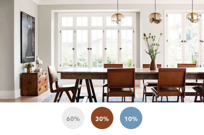
In this case, you can see that the dominant color of the room is tortora white, which clearly occupies at least 60% of this room.
The next most common color is a warm tone of the furniture, which is our secondary color and represents about 30% of the color in this room.
Finally, our 10% accent color is a blue present on the patterns of the carpet. Although these colors are not used much in the general space, they do a great job shifting the interest of our eyes around the room.
Other useful tips for use: 60-30-10 + 10
While the 60-30-10 color rule is a fantastic base for home staging, here are some quick tips to share for smart use.
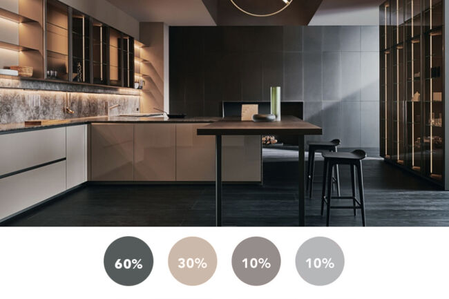
- You can also use 2 accent colors, taking care not to give too much color, which in the long run may get you bored. (60-30-10-10 in the photo)
- It is not necessary to change the same shade of each color. You can use a combination of blue and navy blue, for example, although one of the colors you chose in your palette is blue.
- Work on the opposite colors of the palette to create contrast, for example, an orange hue will match very well with a teal hue, a yellow with a purple, red and white, etc.
- The dark colors shrink the space while the light ones amplifie it.
- Use textures, patterns and designs on fabrics with additional colors outside the three-color palette, but that always maintain a single dominant color.
For example, if the color palette is white, gray and petroleum, you can still use a cushion that also has inserts of other shades ?
Yes, as long as that insert retains a primary color suitable for 60-30-10.

The dominant color of the room is tortora white, which occupies at least 60% of this room.
The 30% of the secondary is a tone similar to the primary, but darker, present for example in the fabric of the sofa.
The 10% of accent color is a more saturated blue, present in the pillows and in high details, on which the look falls, but we also find the second accent color, a pastel pink that enhances the inserts and captures the eye as well.
The color of the varnish can transform and revitalize your home to engage and create cozy home environments. The way to do it is through the 60-30-10, which is not a telephone code, but a guide to getting a harmonious and welcoming home.

[…] Now that we have a brief understanding of how color works, let us now apply the general concept by following the 60-30-10 rule. […]